Stereo Studio
- Agency
- Freelance
- Client
- Stereo Studio
- Year
- 2012
- Type
- Proposal
- Tags
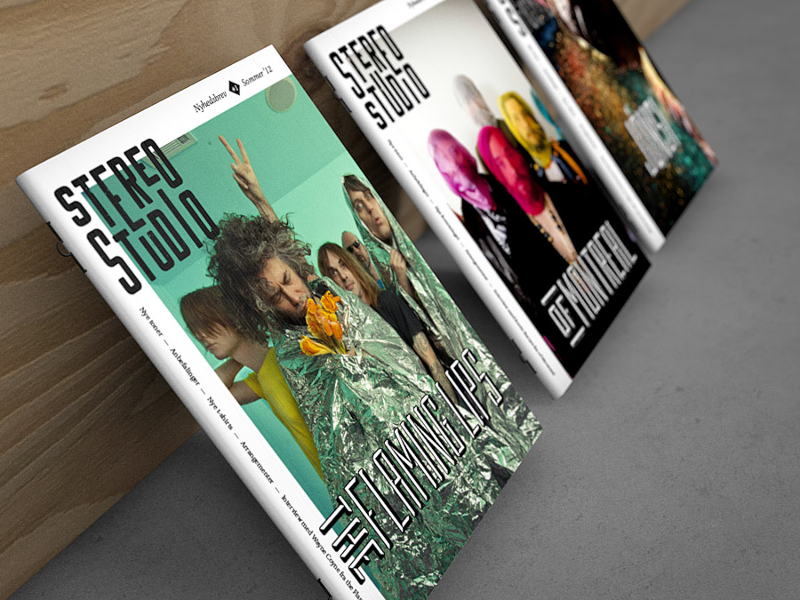
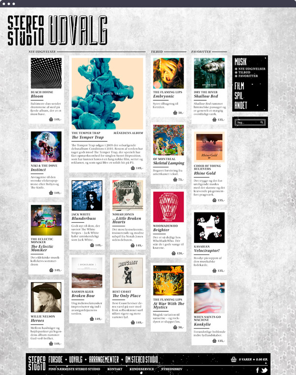
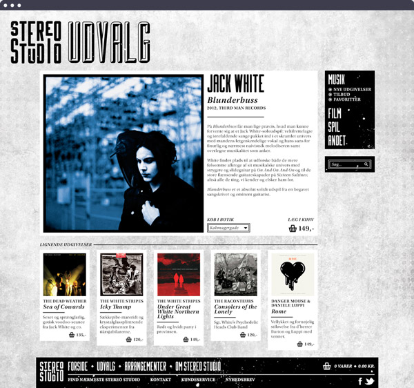
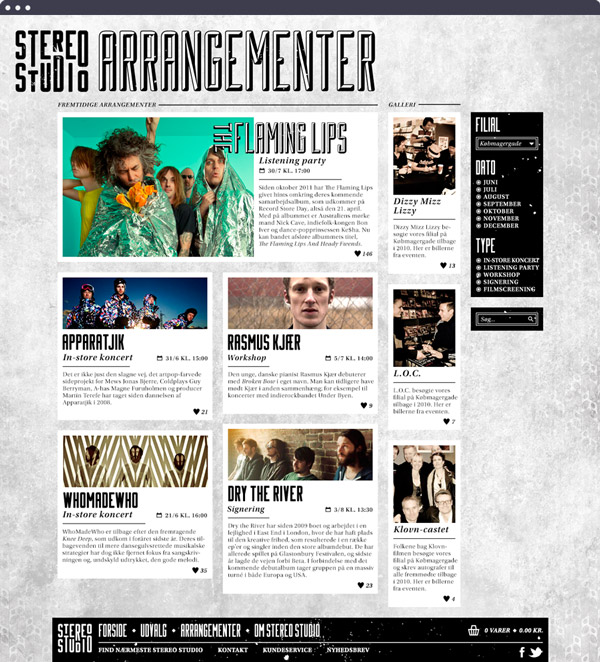
For my Bachelor’s Project at the School of Visual Communication, I did a complete re-branding of Danish record store chain Stereo Studio. Stereo Studio is well-known for its large range of products, cheap campaign offers and solid vinyl departments.
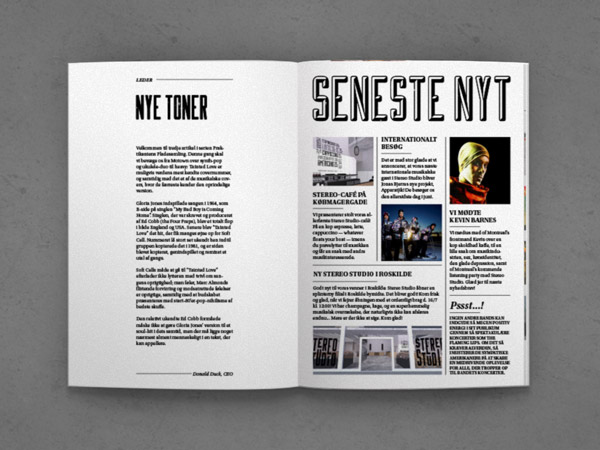
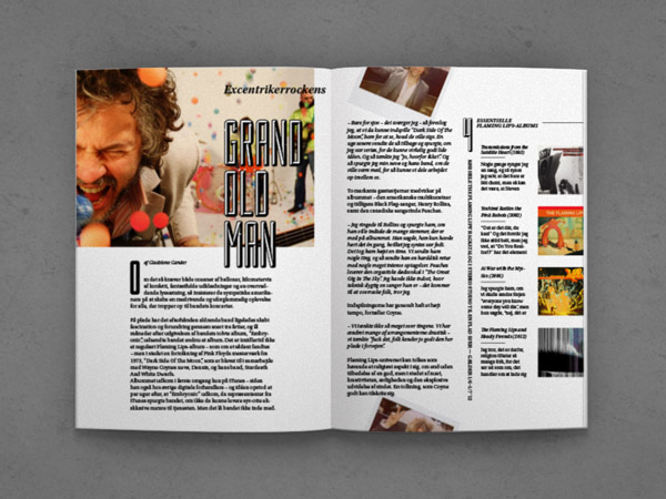
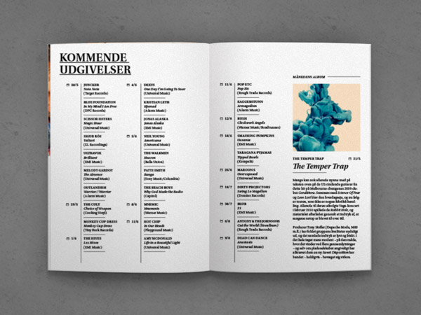
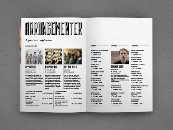
One major obstacle for record stores of today, is the fact that music already is available for consumption online, through streaming services as well as online record shops; giving people less incentive to visit a physical store. Thus, record stores need to offer things that simply cannot be experienced from a couch. In this case, these include a range of events (in-store gigs, signings, listening parties), a magazine-style newsletter, an in-store café where you can kick back and listen to the music before you buy it, as well as active collaborations with local concert venues and festivals.
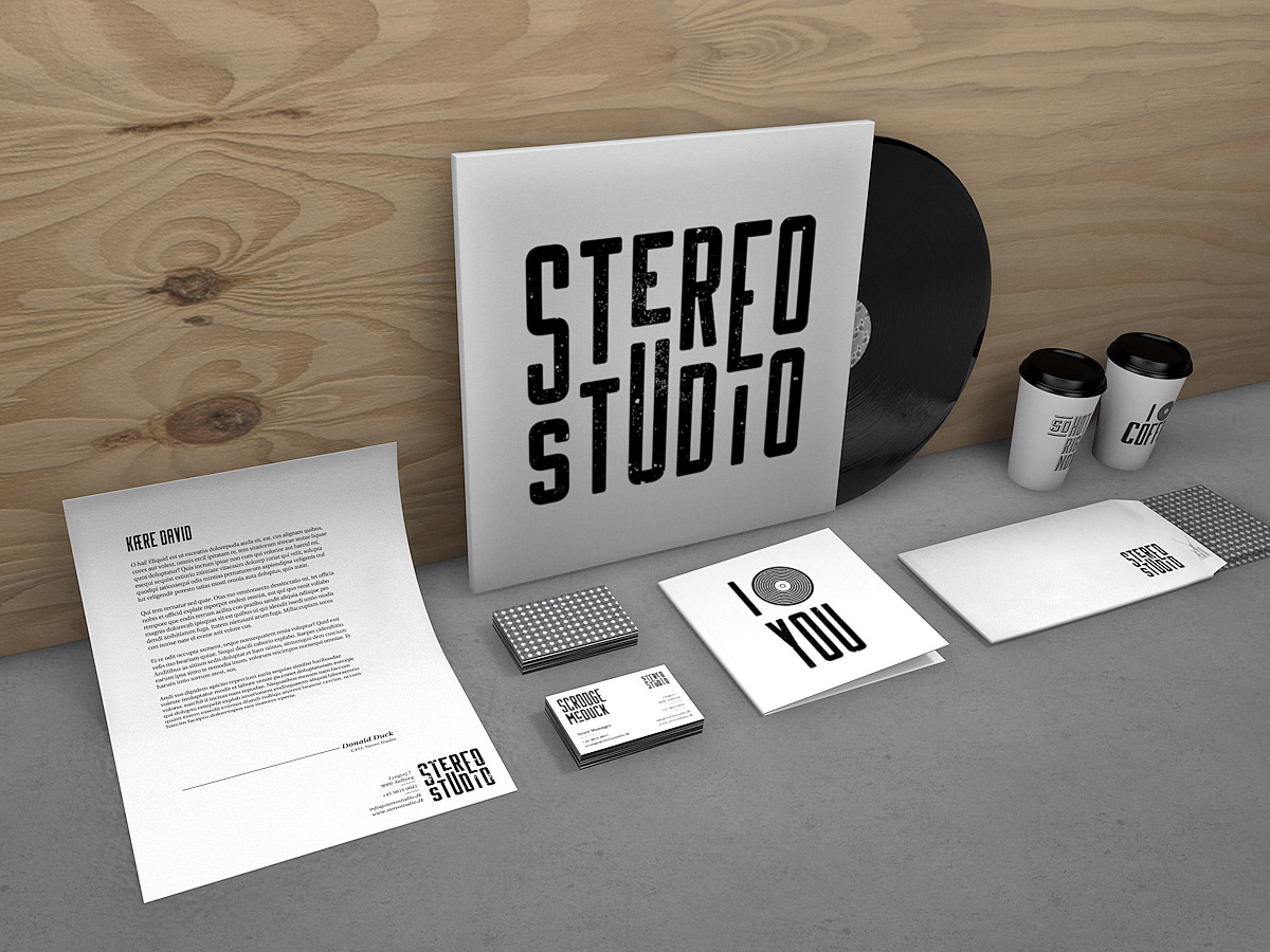
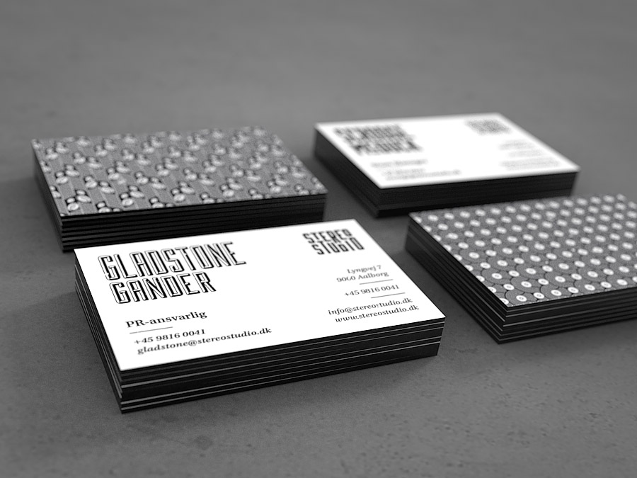
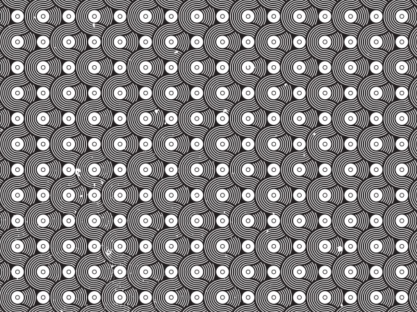

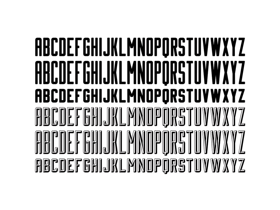
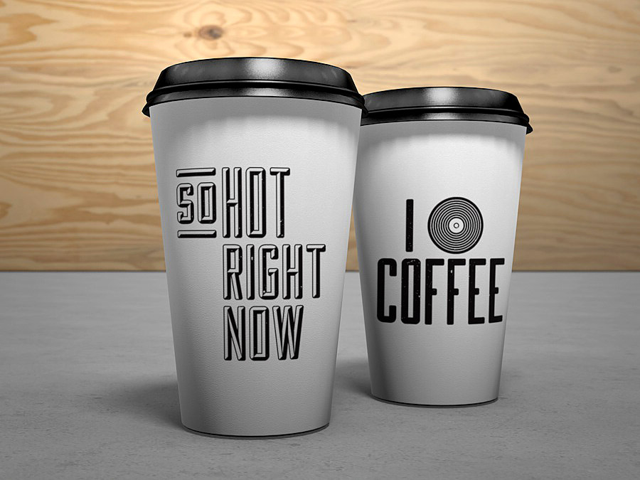
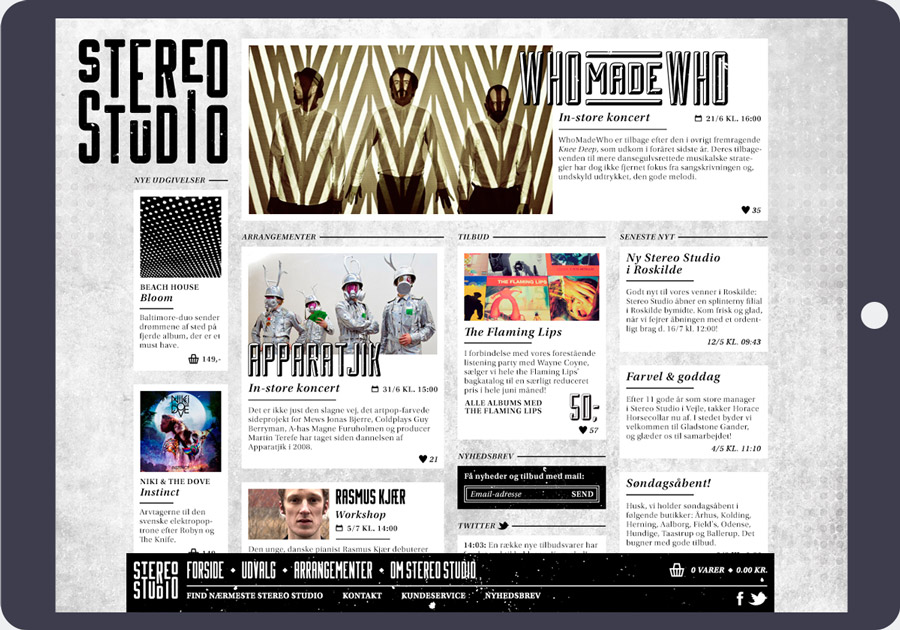
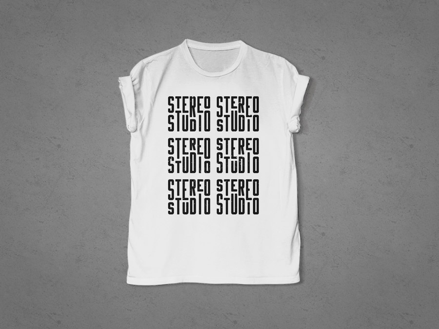
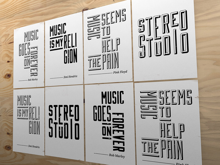
A pillar of the visual identity is the uppercase typeface ‘Equalizer’, which I designed, inspired by posters from the ’70s. It comprises three different heights and two styles, which can be mixed interchangeably for a dynamic and bold typographical expression. It also allows for the logo to have almost unlimited soundwave-ish variations while still being recognisable as the same logo.
No images in this project have been used commercially.