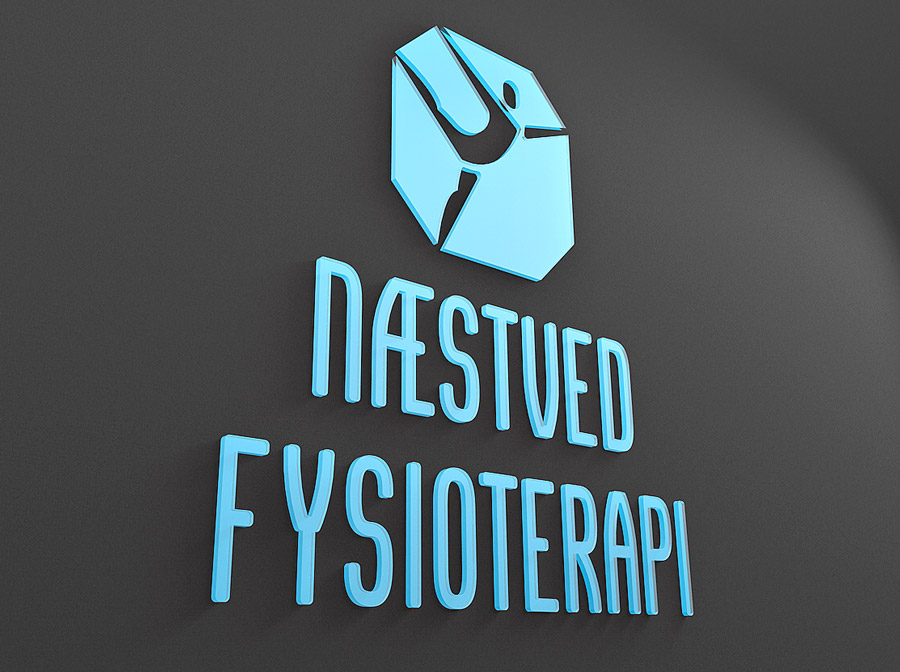
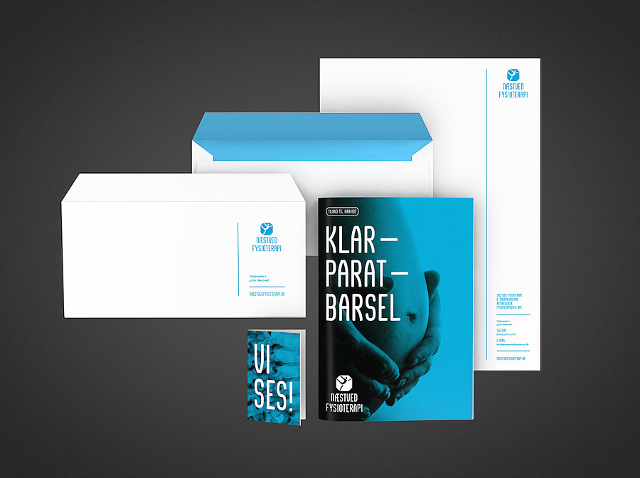
Næstved Fysioterapi
- Agency
- Freelance
- Client
- Næstved Fysioterapi
- Year
- 2016
- Type
- Visual Identity
- Tags
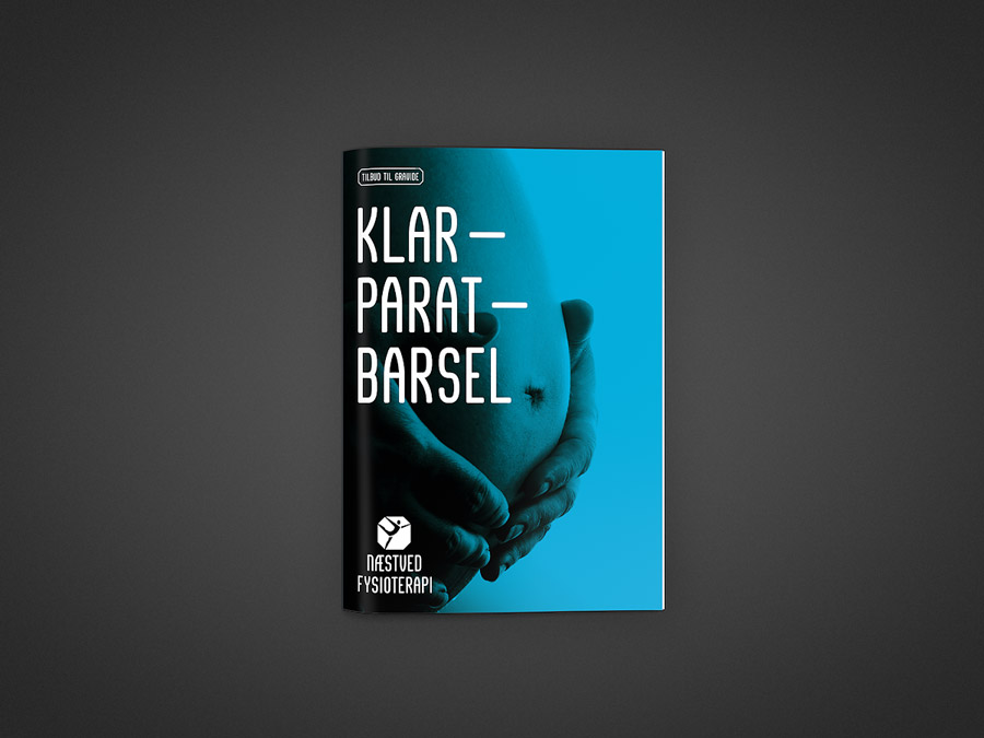
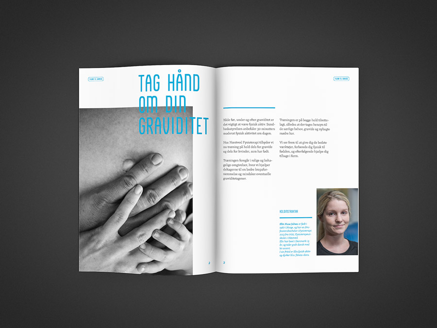
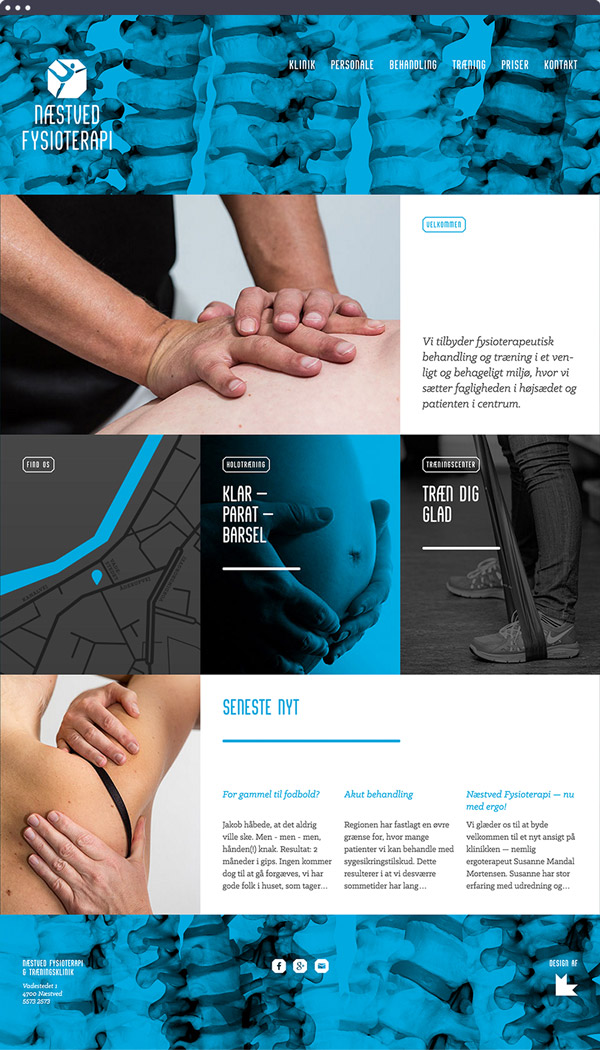
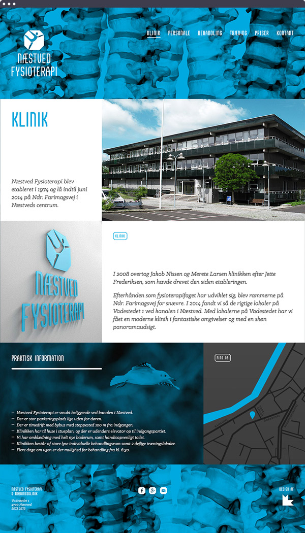
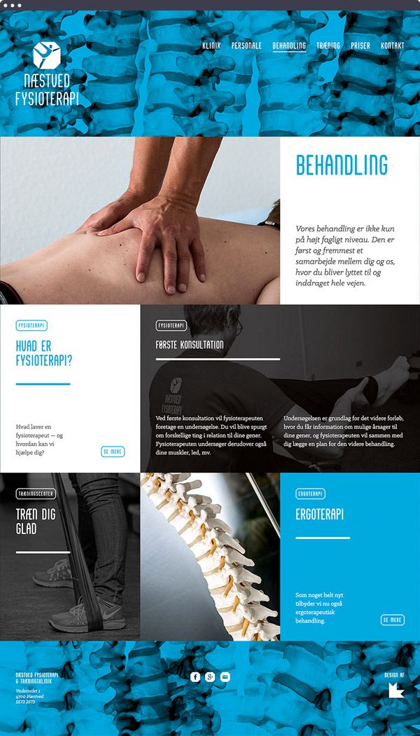
Næstved Fysioterapi is a physiotherapy clinic situated in a Denmark. It has existed since the 1970s, and has a reputation for providing highly professional healthcare in a pleasant and friendly environment.
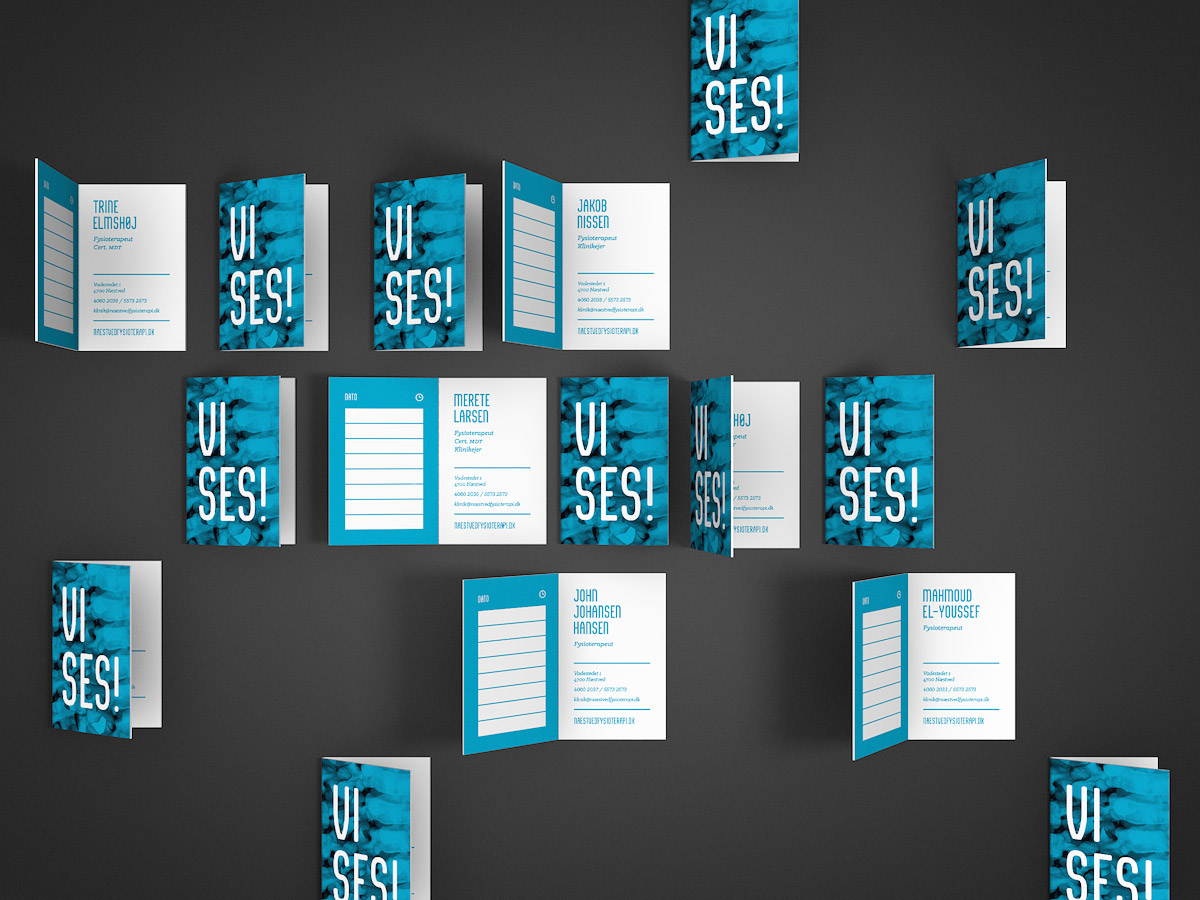
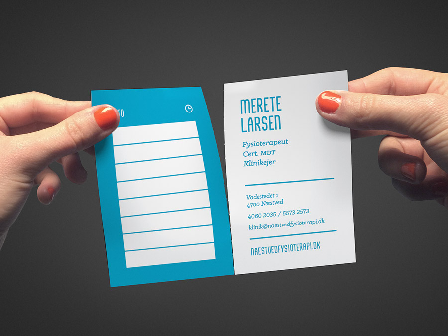
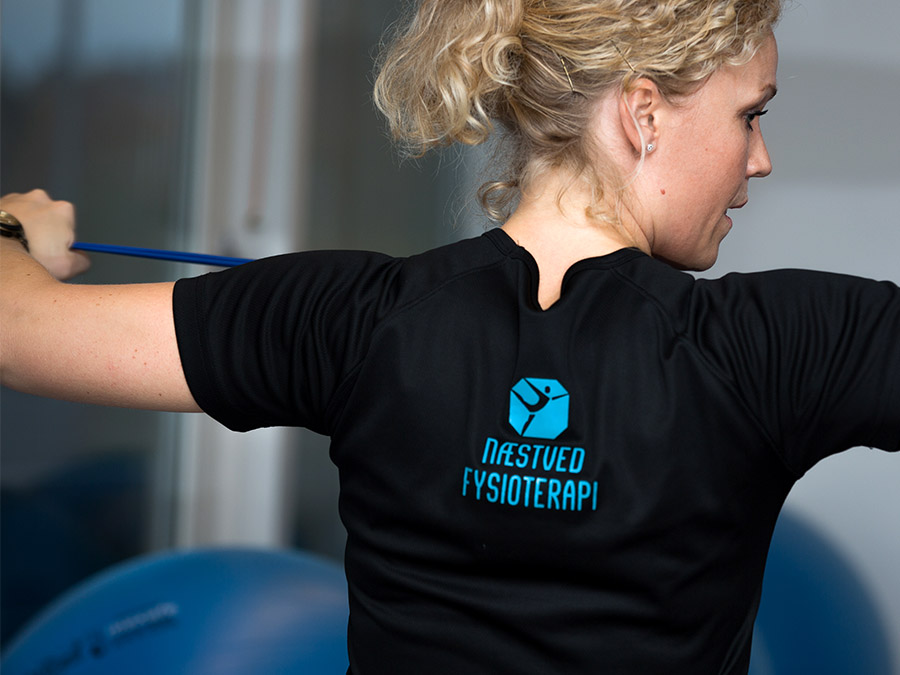
After changing ownership, the new owners approached me to create a new visual identity. The healthcare sector isn’t usually associated with the sexiest design; therefore, I strived to provide them with a visual identity that was both cheerful, flexible and visually interesting, while maintaining a sense of trustworthiness and professionalism.
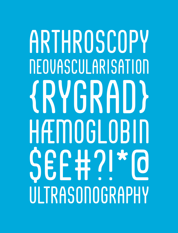
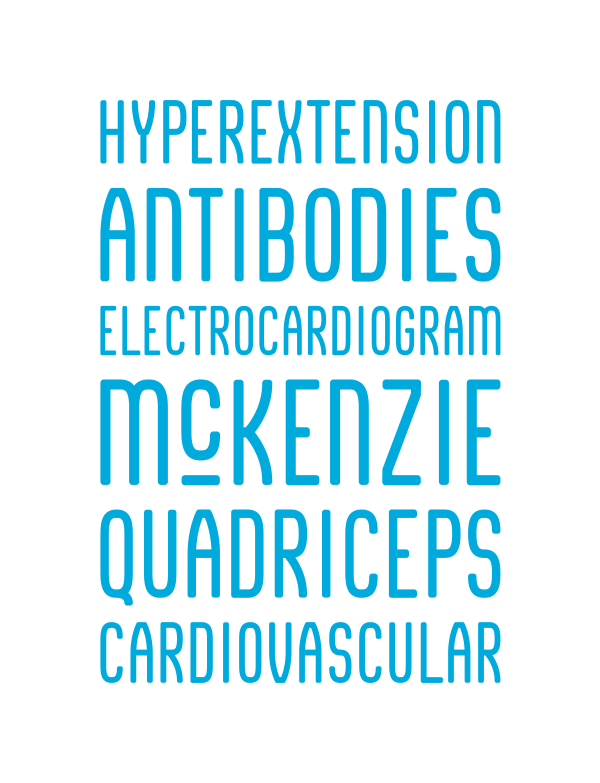
For the visual identity, I designed a full display typeface, aptly named “Rygrad” (meaning “spinal chord” in Danish), to be used for both digital and print. The typeface is visually inspired by the organic structure of skeletal joints and bones, while still maintaining legibility.
See more at naestvedfysioterapi.dk